Case Study
This case study focuses on the redesign and optimization of /login and /register on Dropbox.com through a series of experiments. It also discusses the addition of Google One Tap and customized social button functionality to these pages. As the Lead Designer on the Sign Up / Sign In [SUSI] team at Dropbox it is my goal to address usability issues, increase sign-ups, and create an intuitive and engaging experience for users as they create or log into their accounts.
Problem statement
The /login and /register pages on Dropbox.com were based on an older design system and required an update to the current Dropbox Web Guidelines. The primary goal of this project was to unify and bring consistency to the design of these experiences, reduce friction and errors when signing up for a new account or signing into an existing account, and to increase trust and security by updating the process of verifying users.
Research and analysis
I spoke with customers in focused sessions about the login and signup process on Dropbox, asking them about any challenges, concerns, or observations they had about the current experience. I noted there were concerns that the /login and /register experience was not consistent with the look and feel of Dropbox.com overall. Users were confused by the different appearance of other login experiences for products like Dropbox Paper and Replay.
In comparing Dropbox /login and /register to other SaaS services I noted that many competitors were allowing for additional secure forms of authentication like email links, QR codes, and two-factor authentication. New options like these could be added to the experience and we could test customer trust and success rates for both logging in and setting up new accounts.
SEO conflicts had arisen because of a collision with the term “Dropbox Sign” and the actual Sign In page at Dropbox.com; Customers searching for Dropbox Sign were actually begin referred to the Sign In page for a Dropbox account. Copy would need to be updated in order to prevent this problem from growing worse. Visits and successful registration/login numbers were declining. Sign-ups had been declining steadily for several consecutive quarters.
Key findings
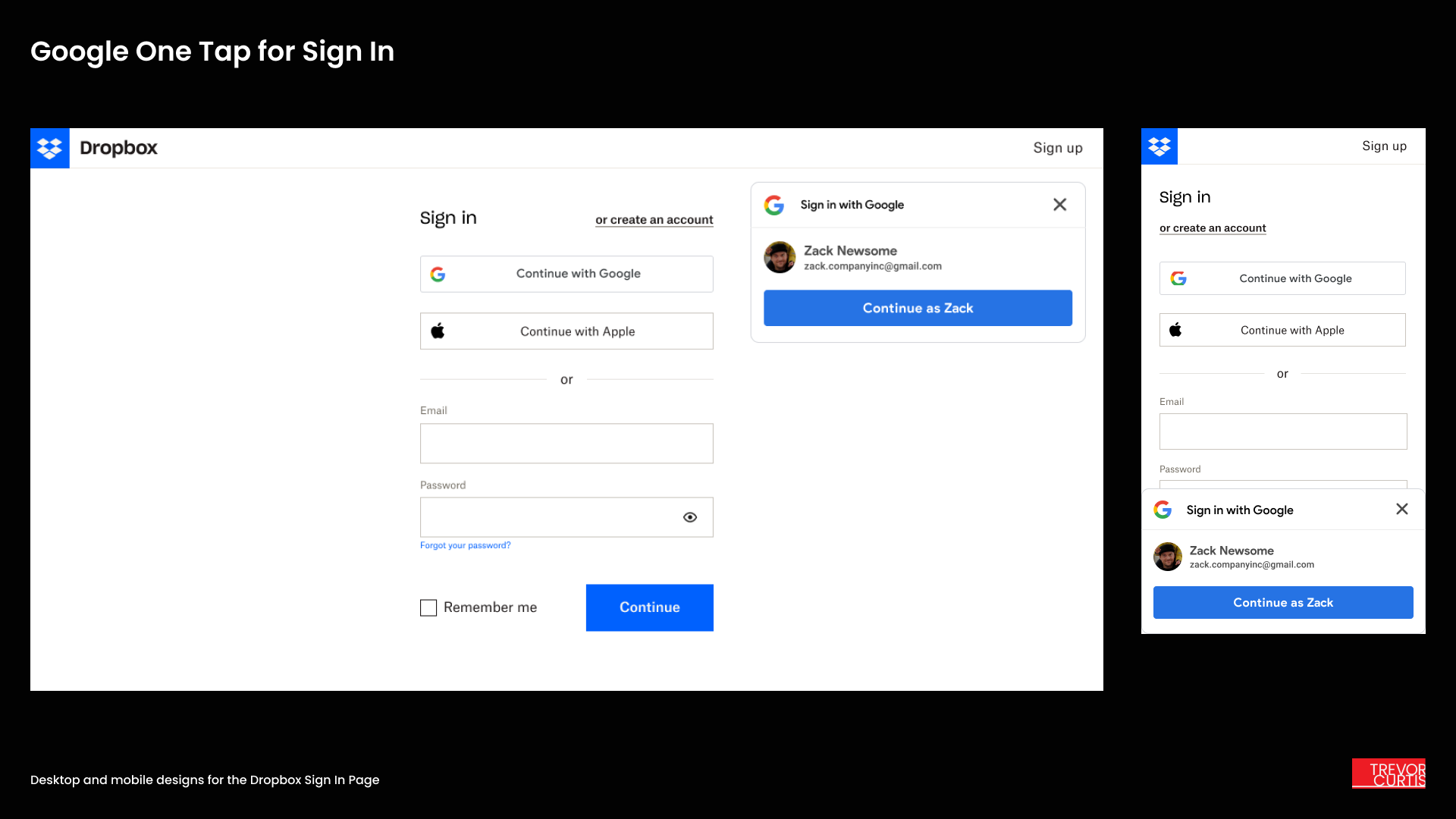
Google sign up/in emerged as the preferred third-party experience among users. I proceeded with the addition of Google One Tap and a customized social button experiment to offer a one-click experience for signing up to Dropbox, or to sign in to an existing account that was tied to a Google email address.
Page speed and the visual experience would be improved by only loading the current design system code rather than relying on older styles from a previous design. This would improve security and user trust in Dropbox by offering a consistent experience that matched the other areas of the website. It would allow me to design a unified SUSI experience to be used on other products like Dropbox Paper and Replay.
Exploring copy improvements and getting legal approval to remove a checkbox requirement to agree to terms of service would streamline the experience and reduce the number of clicks required to sign up.
Google One Tap could be used in other vital SUSI experiences, such as on the Dropbox Homepage or during the file sharing process inside the Dropbox product. Further consistency both in and out of the product would increase user confidence and enhance Dropbox’s reputation of privacy and security.
Going password-free with additional options like email links and QR codes would give users who had been dormant for several months a way to log in and reset their password without intervention from customer support. Responses to password reset prompts would be greatly reduced.
Design delivery
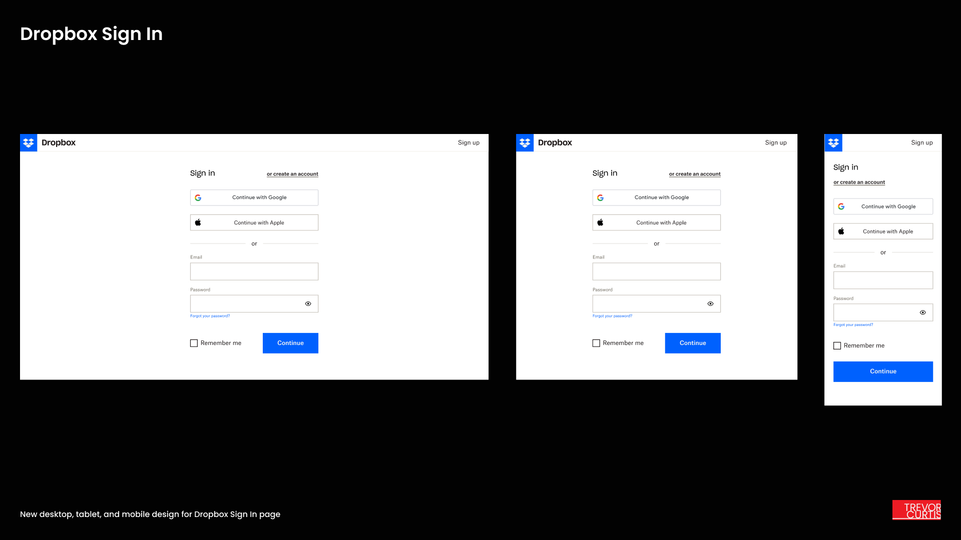
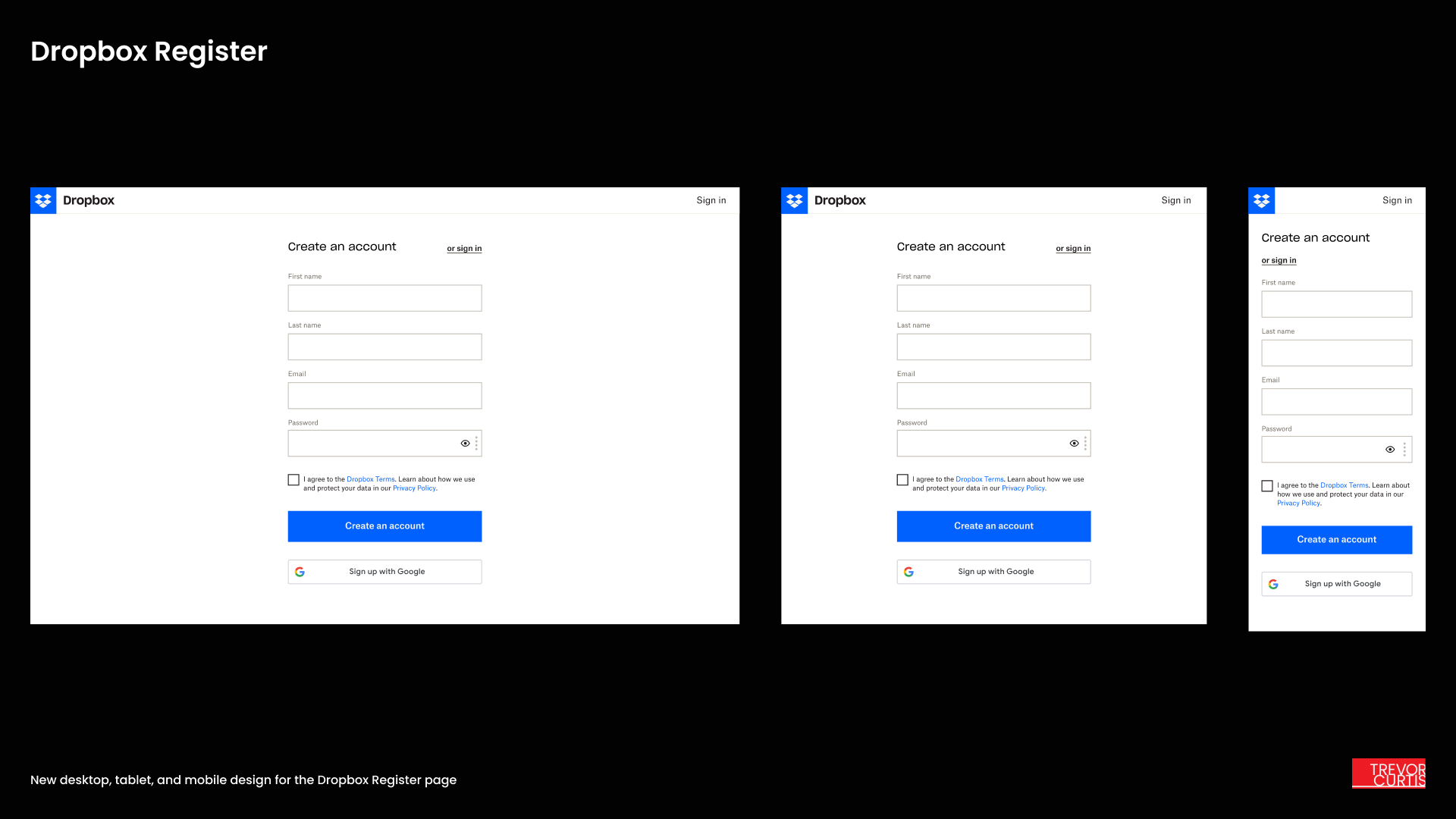
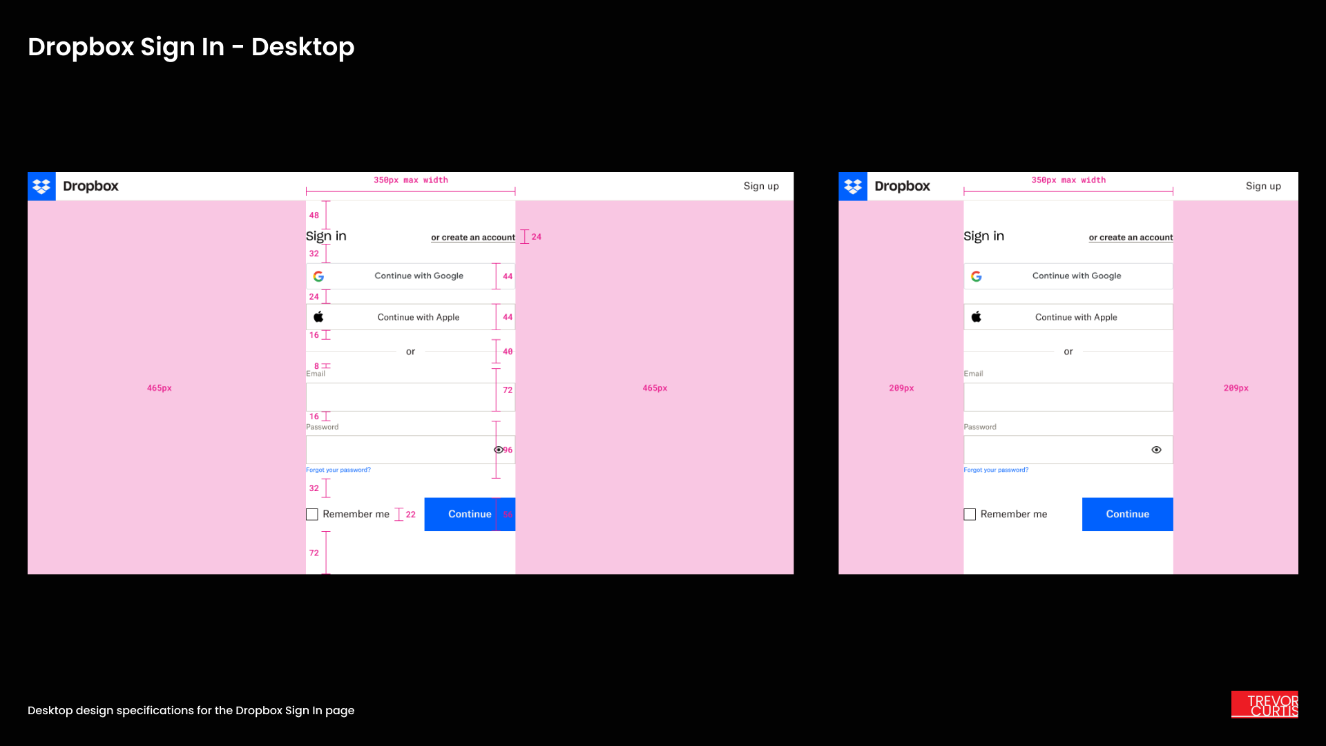
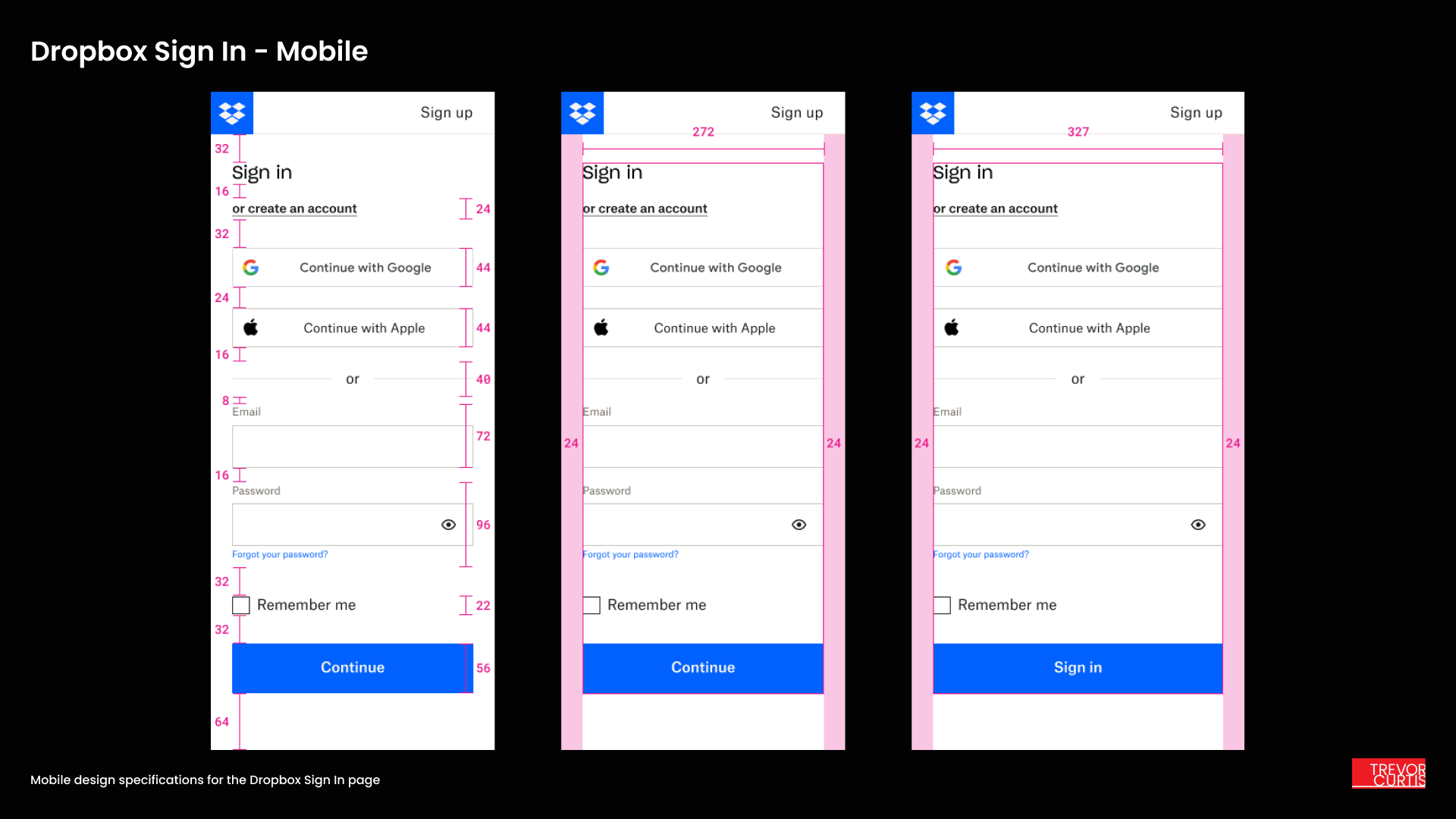
I thoroughly updated the /login and /register experience to adhere to Dropbox Web Guidelines strictly, properly displaying text fields, buttons, helper text, and other elements to match the design system guidelines.
I removed confusing or unnecessary error messages by exploring a two-step authentication process, which I called Progressive SUSI, that intelligently determined if a user already had an existing account based on their email address. This led to the creation of a single flow for all login and register functionality I called Unified SUSI.
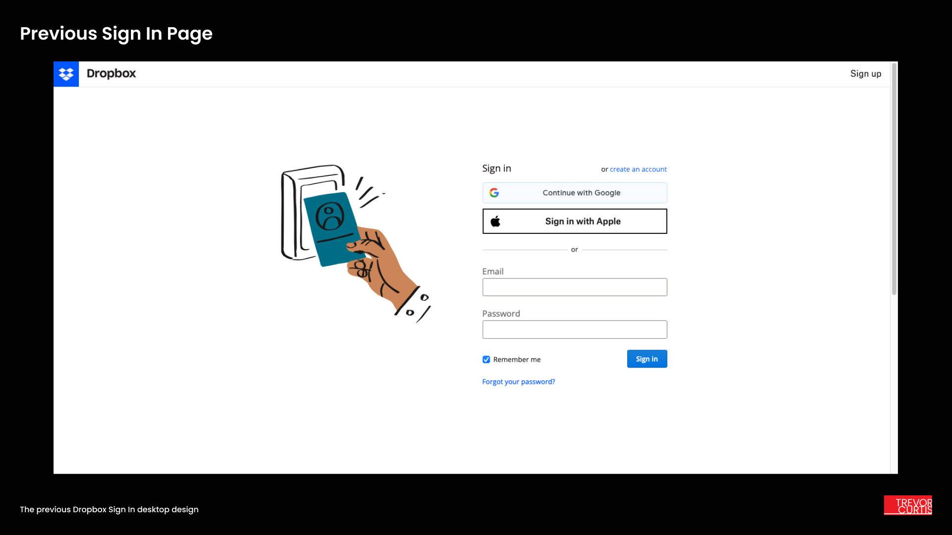
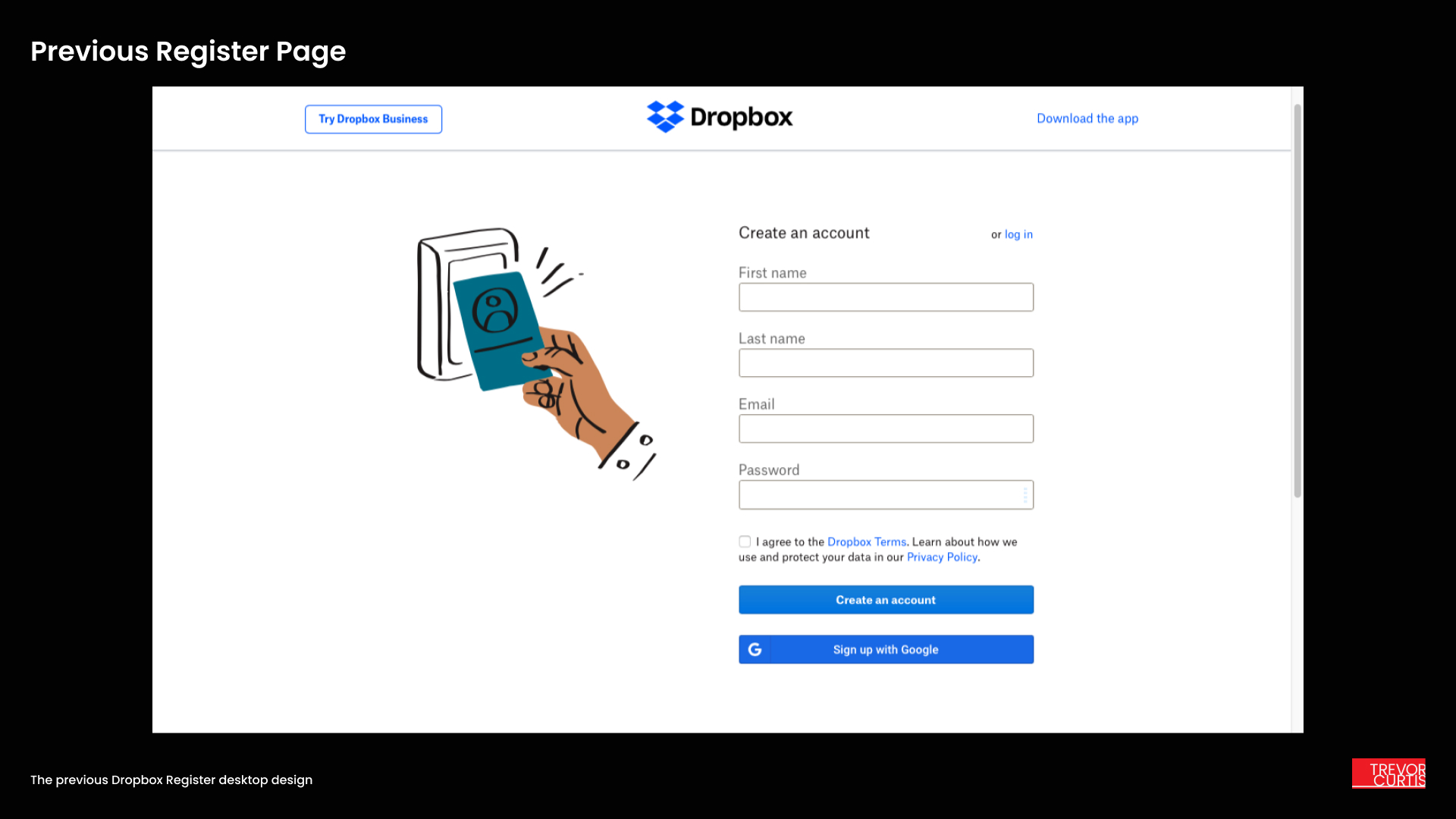
Dropbox utilizes a lot of whimsical illustrations to great effect in marketing materials, but the key-card illustration on the former page designs was taking up valuable visual real estate and distracting from the task at-hand. I removed the illustration and found the design became much cleaner and more focused, a deliberate simplification I wanted to test as part of the design experiment.
I produced detailed mockups and guidelines for the new experience including proper spacing, colors, error states, and more. I worked closely with front-end developers to build experiments that were rolled out on Dropbox.com over a period of two months. After 30 days all flows were evaluated for effectiveness.
Performance optimization
Google One Tap was easy to include on the website, but deciding where to put it was challenging. I tried different positions, for instance inline inside of sign-in and sign-up forms, and found that a placement on the top right of the page performed best. This is also what other websites implementing Google One Tap were doing, and it proved to be the best choice.
When I saw that significantly more people were successfully logging in and signing up using the new form design and Google One Tap, I recommended showing the test design to a larger share of 75% of users. I saw a 20%+ increase in sign-ups and a 3% increase in successful sign-ins over the entire two month experiment period. This was quite surprising considering I had also updated the login and register pages to look better on mobile devices. Mobile web sign-in and sign-up were typically much lower due to use of the Dropbox mobile app.
The changes I made to the login and register pages helped improve the experience for mobile users, who were previously using an older-looking login page. The new pages work better for all mobile users.
Evaluation and results
The combination of a complete design refresh, adding Google One Tap and customized social button functionality, and moving towards a Unified and Progressive SUSI experience resulted in massive gains of 30%+ YoY in sign-ups for Dropbox accounts. More users were signing in through mobile web once the new design launched.
The /login and /register improvements completely reversed a multi-quarter downward trend in new sign-ups, resulting in a surprise uptick in paid subscriber count, which was noted in a Dropbox financial results call. My team’s efforts were recognized company-wide for bringing in new users and reactivating dormant Dropbox accounts in 2023.
Key takeaways
Optimizing a sign up / in experience can not only enhance the success rate of getting into or setting up a new product, but it can increase the trust that customers have in the consistency and security of systems.
Even small changes in copy or reducing the number of steps in a process can have huge benefits to users as well as to companies that genuinely value customer experience. It boosts conversion and reduces the need for assistance.
Google’s authentication and verification tools are an excellent and flexible way to offer visitors a simple experience signing up for and into a product. I would enjoy implementing those tools in another product in the future.