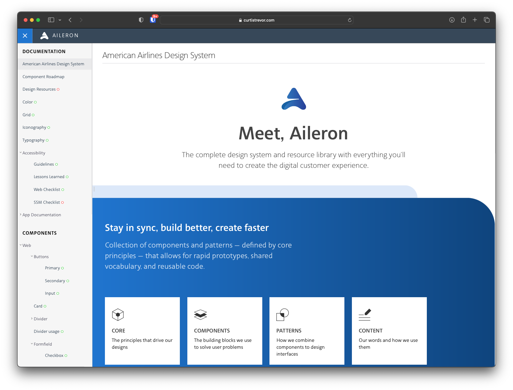
Aileron
Aileron is the ultimate collection of visual design and user experience materials for all the digital products designed at American Airlines. In 2018, I began unifying our team around a single design language to make it easier to develop future digital products.
Aileron is based on an open-source design system documentation project called Fractal. In 2018 I began exploring how I could customize Fractal to create a design system documentation site for American Airlines.
Aileron is a combination of Sketch and Axure RP component libraries, font files for the American Sans typeface, custom icon fonts, and code. HTML5, CSS3, and JavaScript were written for an Angular front-end to produce new digital products at American Airlines.
Aileron made extensive use of Storybook to show live front-end design components for both designers and developers to inspect. Aileron is a resource for designers, researchers, developers, and content creators to see American Airlines’ digital guidelines in one place.
Seat Map
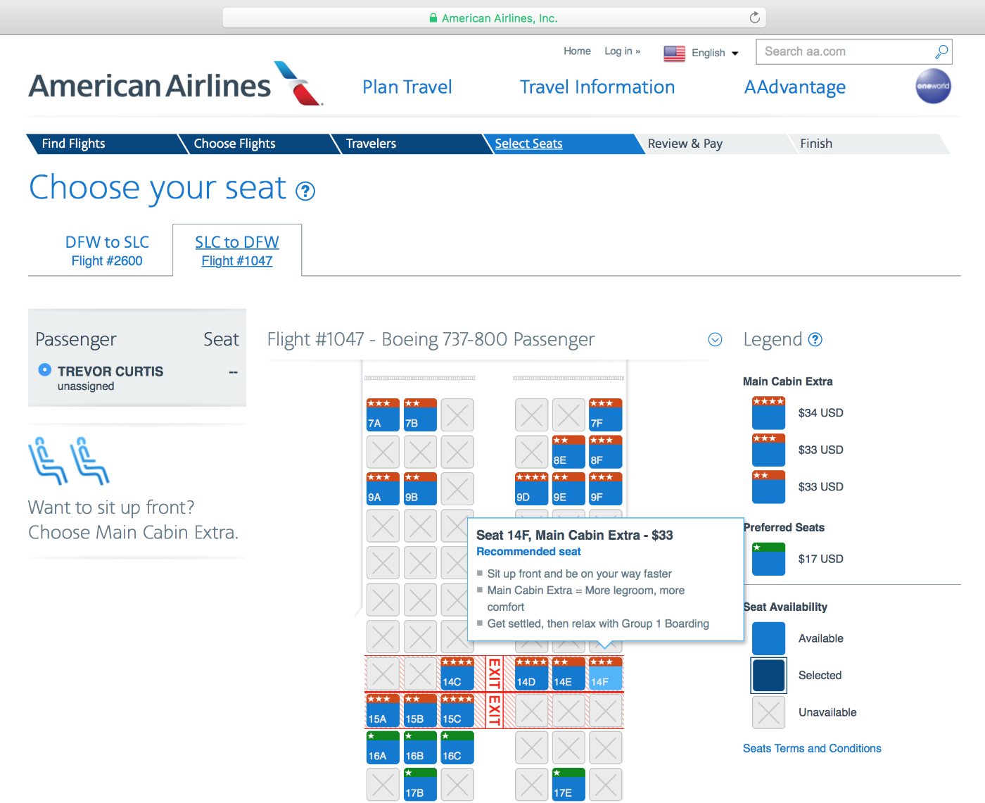
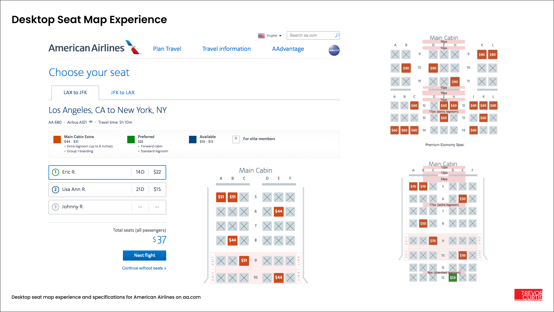
I completed a new seat map experience for American Airline’s customer booking flow, which is still in use today by millions of customers weekly. Over a period of three years I provided design support for the addition of new products to the seat map, as well as enhanced messaging.
If you’ve ever chosen a seat for an American Airlines flight on a desktop computer, mobile device, or at an airport kiosk, you have experienced this design first-hand.
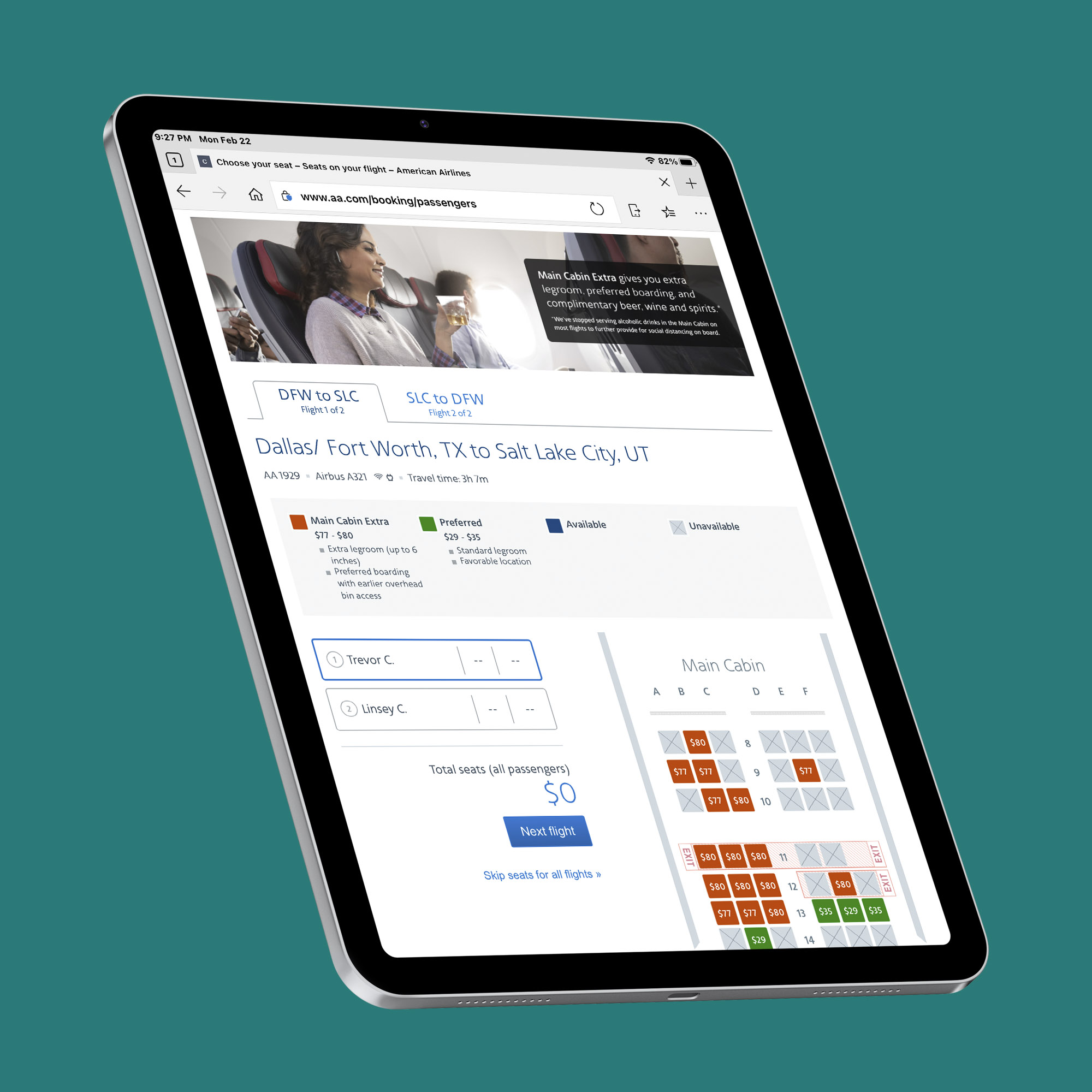
American Airlines experienced an immediate 5% increase in premium seat sales when the new design launched in 2016, and several additions generated even more revenue through 2019. I was responsible for creating prototypes, final visual designs, conducting user testing, and providing development support for the seat map over a three year period. I performed several user tests with Elite customers at the DFW International Airport to measure task-based efficiency and to gather visual feedback on the new design.
The previous seat map relied on a right-hand legend with tiles that had small star ratings, so it was very difficult for customers to understand what type of seat they were purchasing without constantly referring to the legend on the right-hand side.
The previous seat map also did not clearly indicate your running total if multiple seats were selected.
American Airlines seat map as it appeared in 2015 before the re-launch
The new seat map experience is clear, informative, and has a simple step-based path to follow.
The new map makes use of color-coded tiles, with the seat prices written inside the tiles, to clearly show which seats have premium features. Extra vertical spacing in the seat map grid visually indicates which seats have additional legroom near the front of the aircraft.
In 2017 the seat map was enhanced with accessibility features for blind and visually-impaired users to allow for keyboard navigation and spoken text using screen readers. The new design meets WCAG 2.0 Level AA accessibility standards as mandated by the FAA. Customers can navigate the seat map using the keyboard only through the use of WAI-ARIA tags and alternate text.
New marketing banners were added in 2019 to further market premium seats, highlighting extra legroom, preferred boarding, and complimentary drinks. During a live A/B test lasting 30 days, the new banners generated an additional $300,000 in premium seat sales. The banners were approved for permanent display in the seat map and are now a prominent part of the seat map experience.
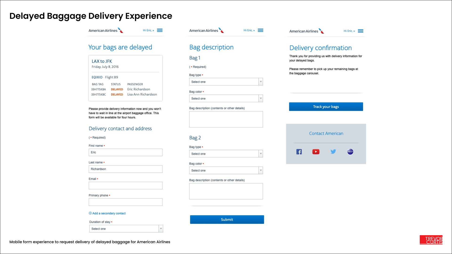
Delayed Baggage
I designed a customized delayed baggage delivery experience for passengers whose bags are delayed upon arrival. Passengers have the option of requesting that their bags delivered to a specific address upon arrival. To lower complaint calls to the FAA due to lost baggage, I was tasked with designing a streamlined baggage request experience that allowed passengers to give American Airlines details about where would like the bags delivered without having to speak to an agent or call the airline.
The new baggage delivery experience gives passengers more control and greatly reduces complaint calls and questions at the airline counter. American Airlines is able to proactively let the passenger know there is an issue and provide them with a self-service solution, in some cases even before they land at their destination.
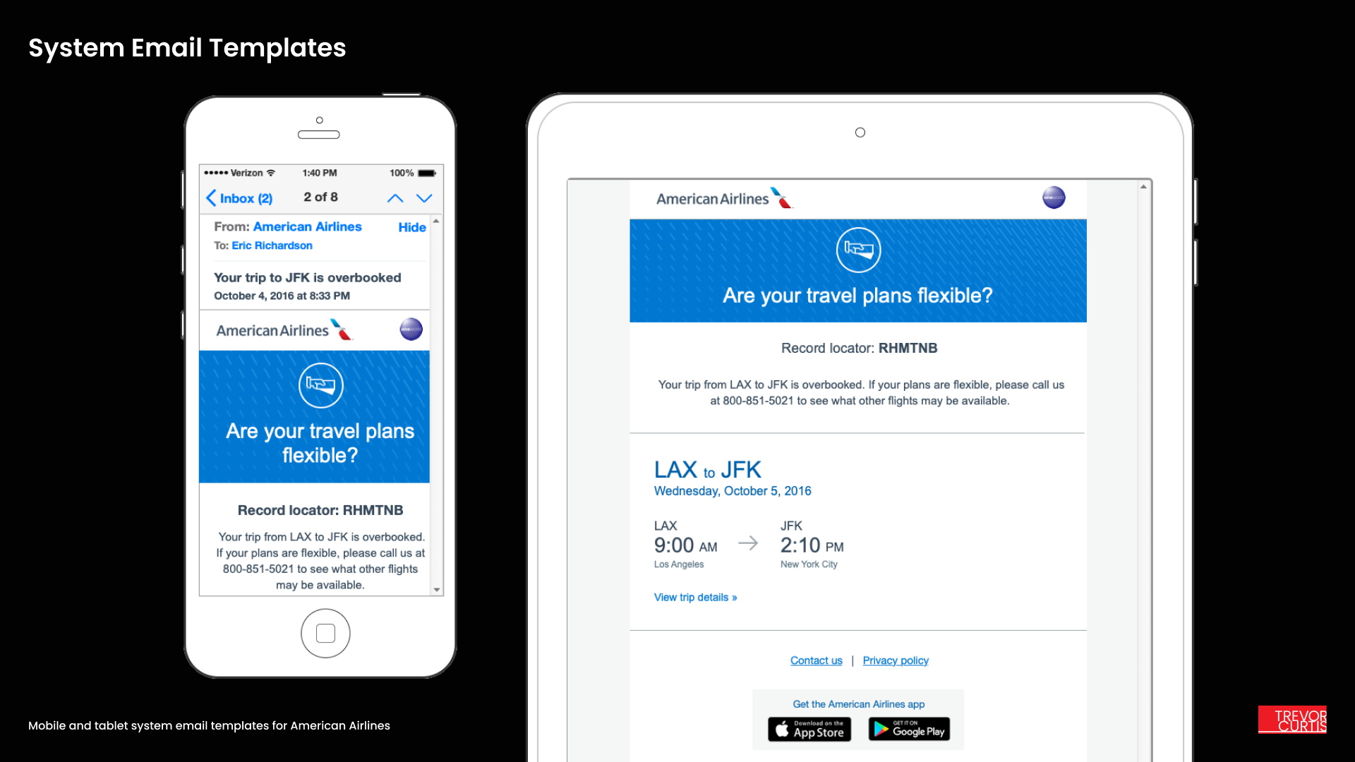
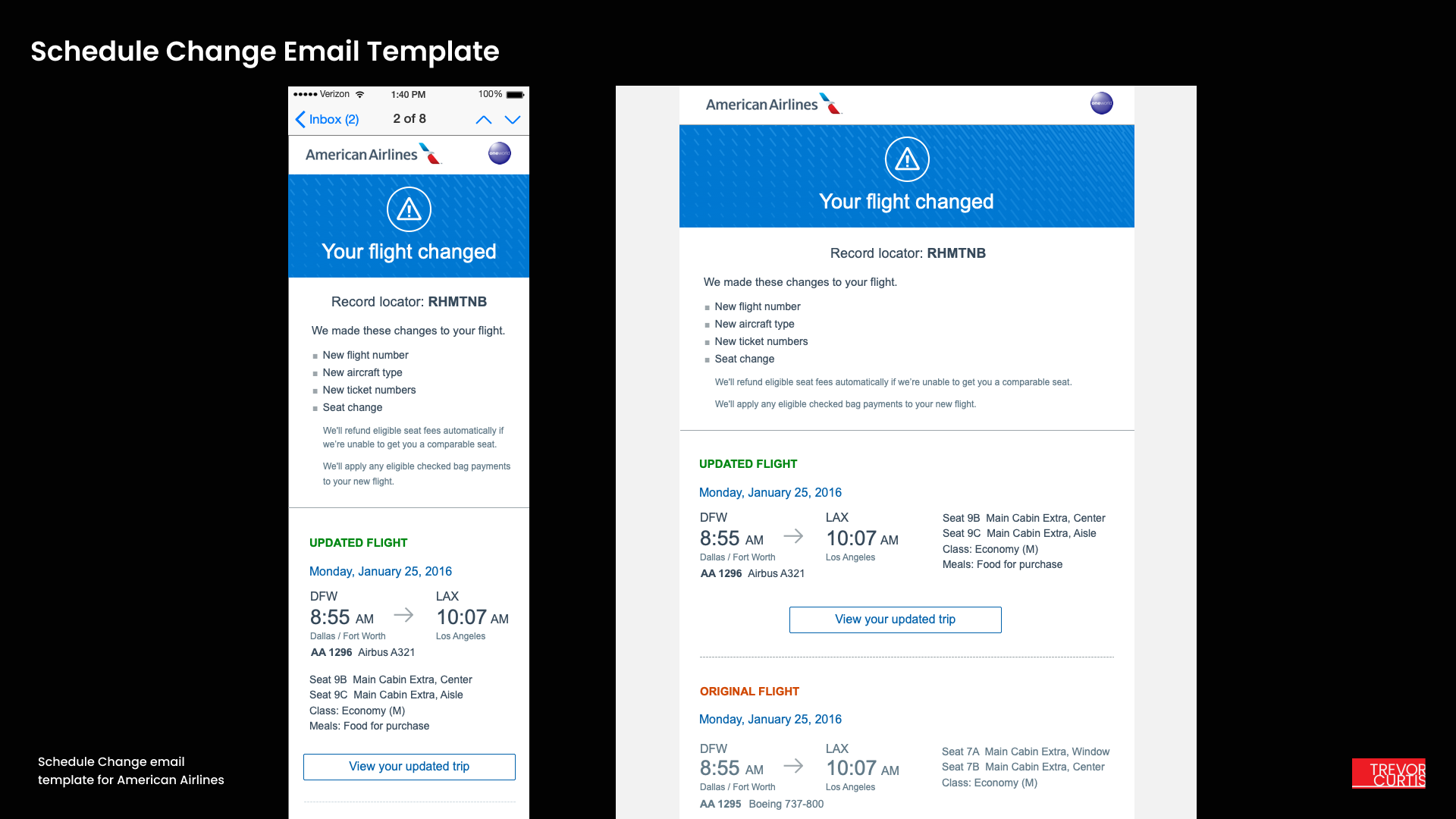
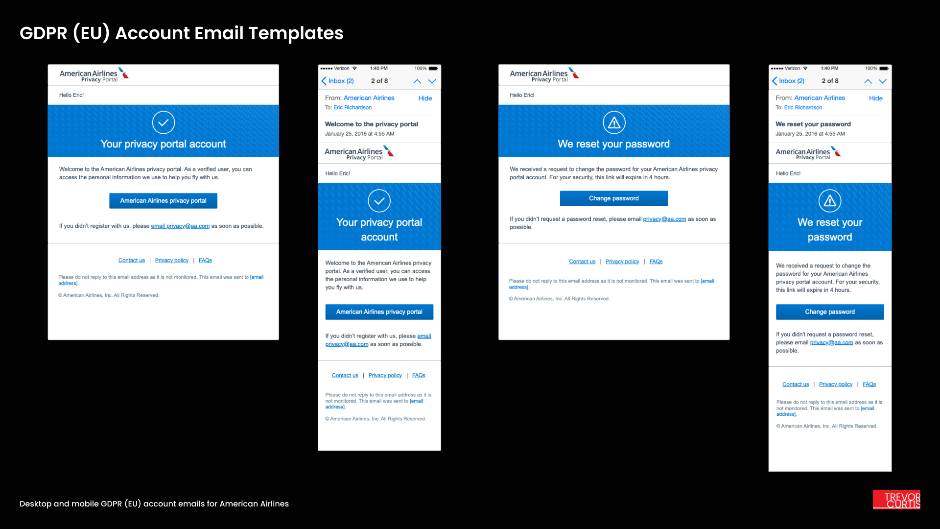
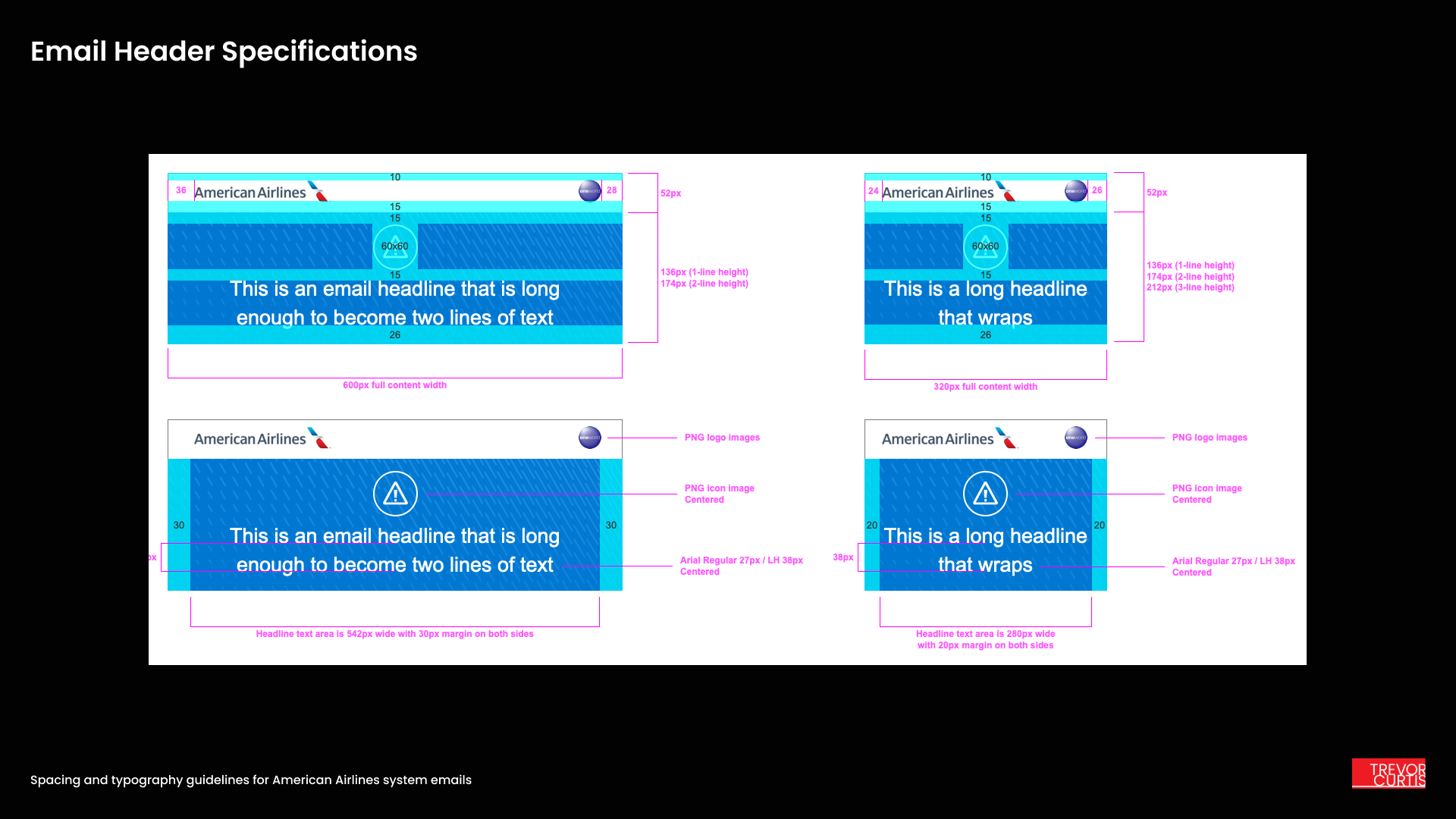
AA System emails
I designed all of the American Airlines system update emails that are sent out to passengers for flight cancellations, departure changes, and checked luggage status. Each template is optimized for a desktop and mobile presentation, and great care was taken to accommodate long titles and a dense presentation of important flight details. Color and typographical sizing communicate important information at a glance. I was able to make use of American’s large custom icon library in the header area to add some delight to what would otherwise be a very stressful communication for passengers.
These email templates were launched in 2016 and are still in use by American Airlines today.