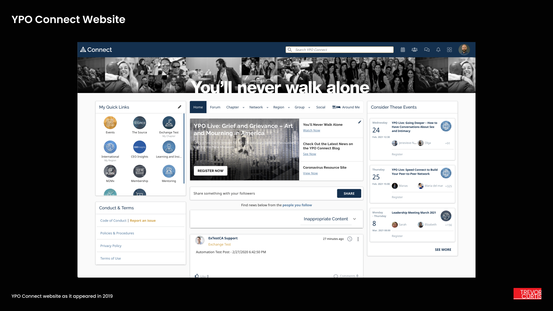
YPO Connect
While working as a senior designer at YPO I refined and improved the Connect portal, the primary application for YPO members to connect and learn from each other.
YPO Connect is a dynamic website that allows members to participate in online and in-person events, private forum meetings, and access other benefits that come with their membership.
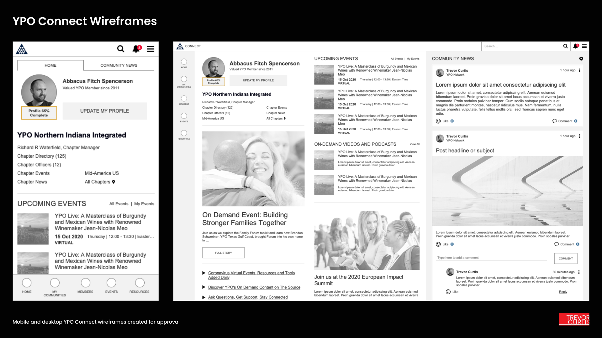
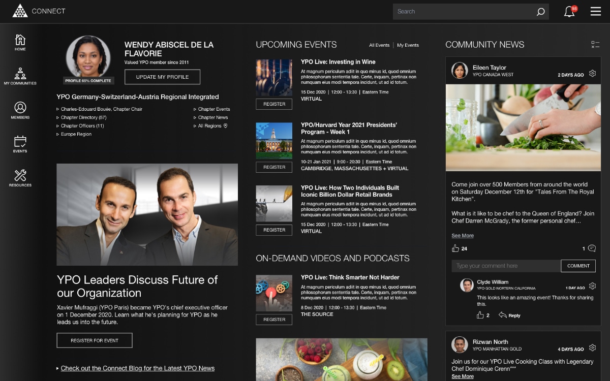
A new layout and IA
YPO Connect benefits from a multi-column responsive layout with clear hierarchy and separation of concerns, with subtle shading and strong typography to make scanning content easy. A new simplified menu system and clearer site information architecture makes it simple to access all the exclusive benefits that come with a YPO membership.
I conducted research and usability testing to formulate a new menu structure that grouped and listed the many resources YPO makes available to its members. Simple black-and-white wireframes and a clickable prototype provided clear direction on how to improve YPO Connect’s user experience.
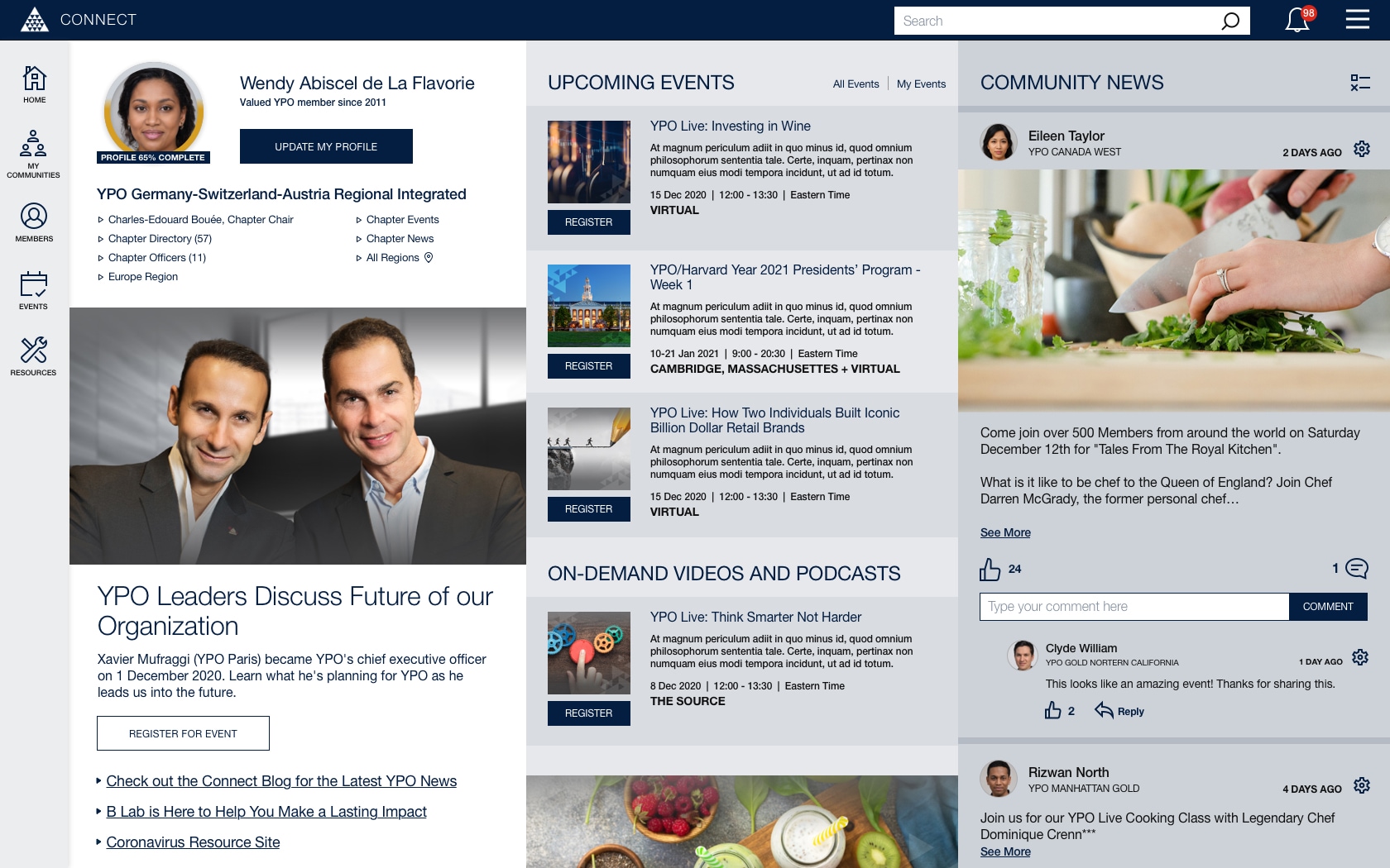
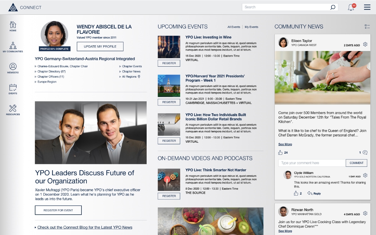
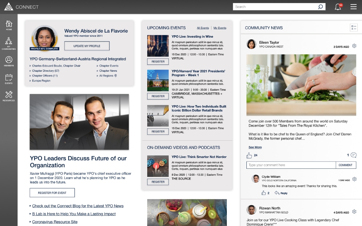
YPO Connect Homepage design proposals, including dark and silver themes
YPO Event Directory
The event directory of Young Presidents Organization’s Connect website helps members find and register for events at the chapter, region, and global level. YPO members are a diverse group of chief executives who want to be informed of the latest innovations in industry, service, and leadership.
YPO events are scheduled for members, spouse/partners, and are also available for the children of YPO members through the YNG program.
The new Event Directory design project for YPO began as a mobile-first directive with a goal to make the smartphone experience better.
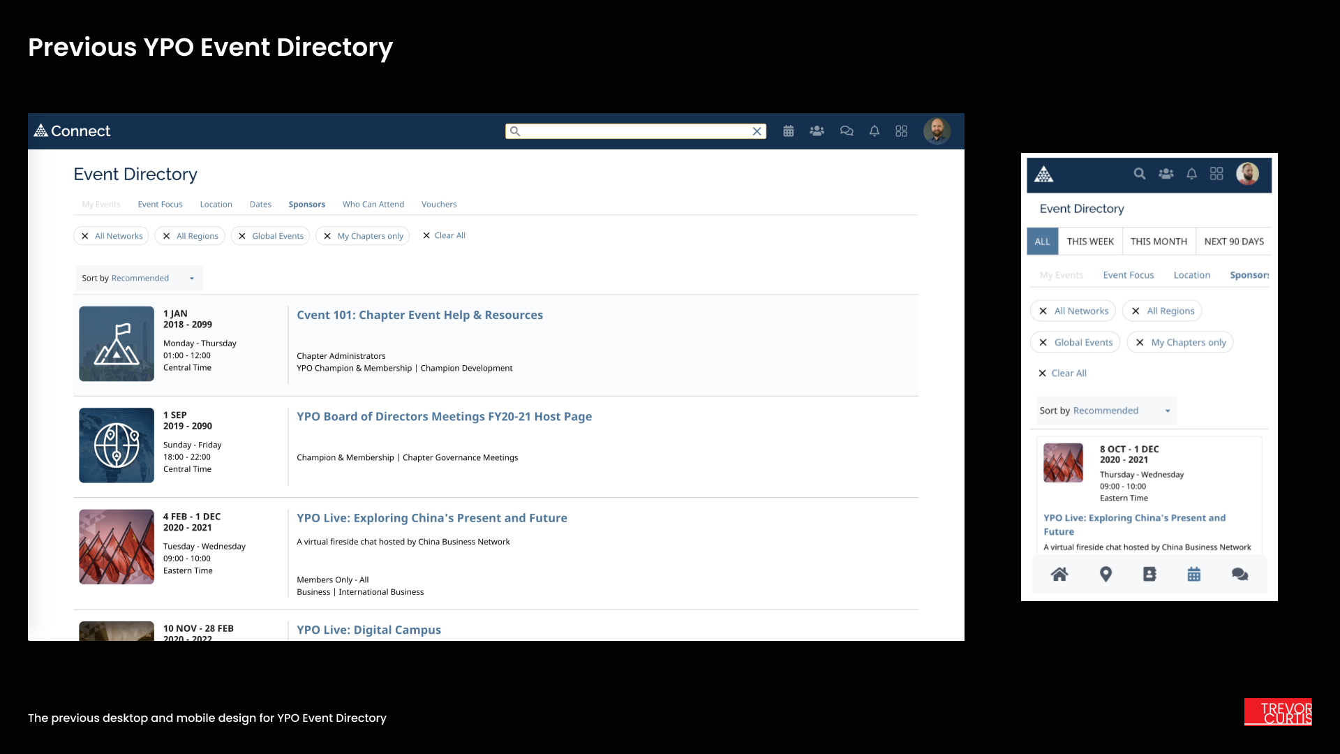
The original event directory experience was based on a list of horizontal event list items, with each event displayed across the entire screen width. The filtering and sort functionality was located across the top of the screen below the header.
The previous design left little room for actual event information, with filtering, sort, and filter bubbles taking up more than half of the display area on an iPhone 8 device.
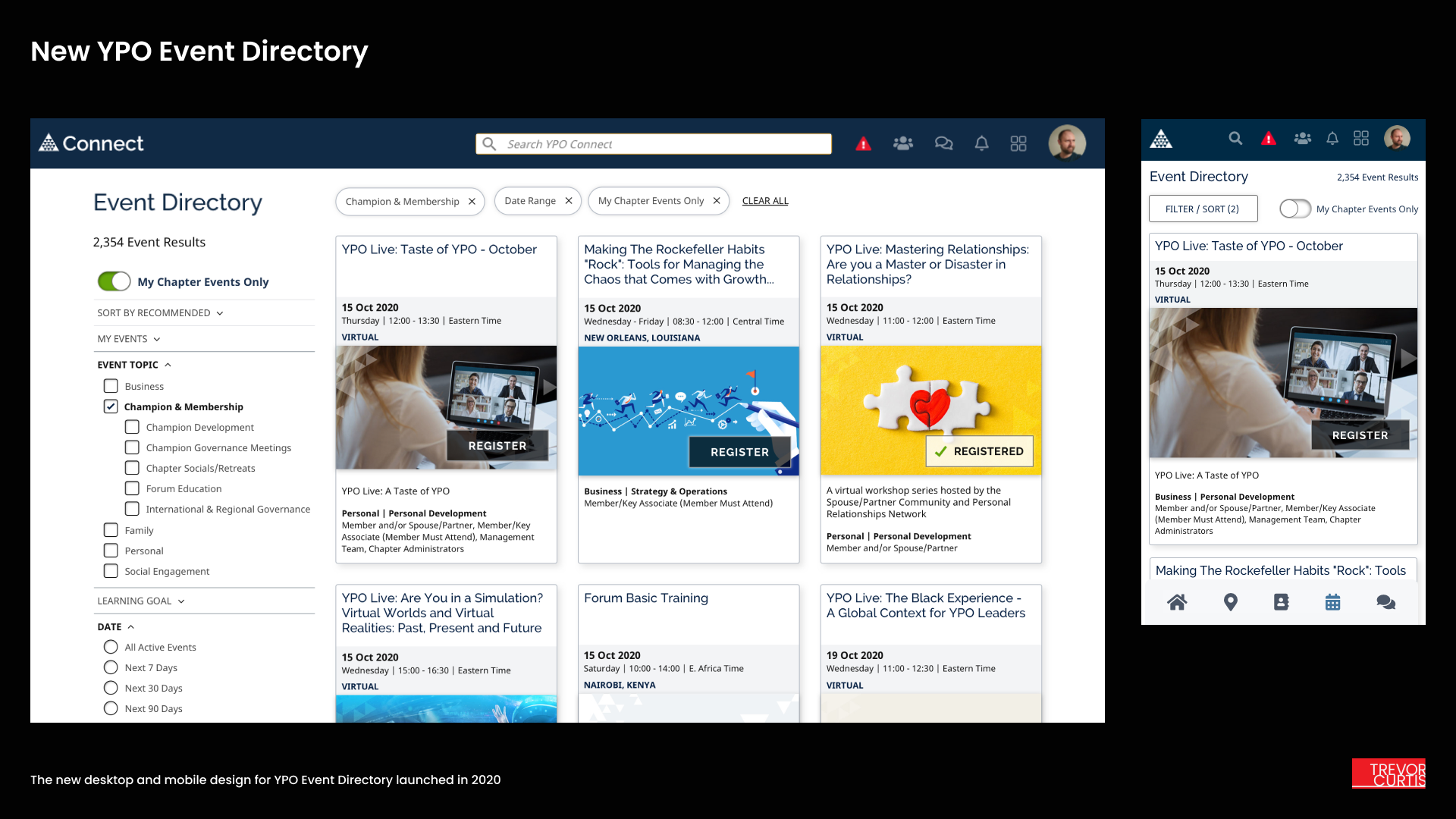
When I began creating wireframes for the new experience, I made the decision to move towards an event card design so more events could fit on the screen before scrolling. I built some informational blocks to add consistency to the hierarchy of event details inside the cards and make them easy to scan through visually in a grid. Links and buttons on each card would be consistently placed to make it easy to register.
After iterating on several card designs and collecting user feedback, I began stress-testing the designs for different kinds of events. Each card contains a simple title, time and date information, an engaging image with a clear call to action, and some audience and attendee details. I made sure the cards still looked good even if certain details were not present. Cards remained a fixed height even if content proved to be short, making the cards easy to scan in a Z-shaped consumption pattern.

High-fidelity card template for the YPO Event Directory
With a robust and responsive event card design completed, I designed a tighter mobile experience and tested out how the desktop view would look with various densities of event cards in a grid layout.
I produced high-quality mockups of the event directory interface in Sketch app at several device breakpoints, including ultra-wide monitors.
I provided developers with a simple coded HTML5 / CSS3 prototype of the event directory card design and responsive layout employing CSS Grid, CSS micro-interactions on hover, and UI behaviors from mobile all the way up to ultra-wide displays.
Special considerations were made for the mobile experience because the UI of the previous event directory didn’t allow for much information to remain on the screen.
The new mobile design makes use of a full-screen modal to house all of the filter/sort functionality. That cleared up the top of the website so at least one full event card is always visible before scrolling, even on smaller screens or viewports.
As a result of this design launch, despite the COVID pandemic, event registration increased more than 15%, and there was a dramatic increase in time spent on page, with more engagement on individual event landing pages. Users were better able to find and sign up for relevant events and the improved mobile experience allowed more members to sign up for events on the go.