Callouts
Callouts
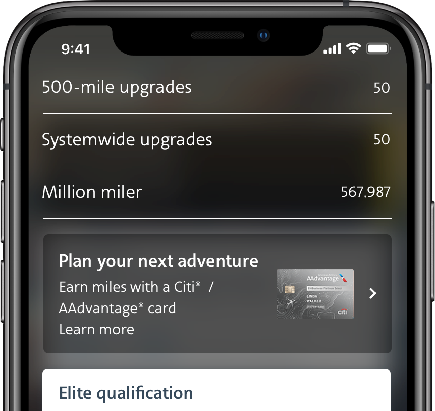
Floating cards that inform users of changes or offers relating to their flight.

Examples
Usage
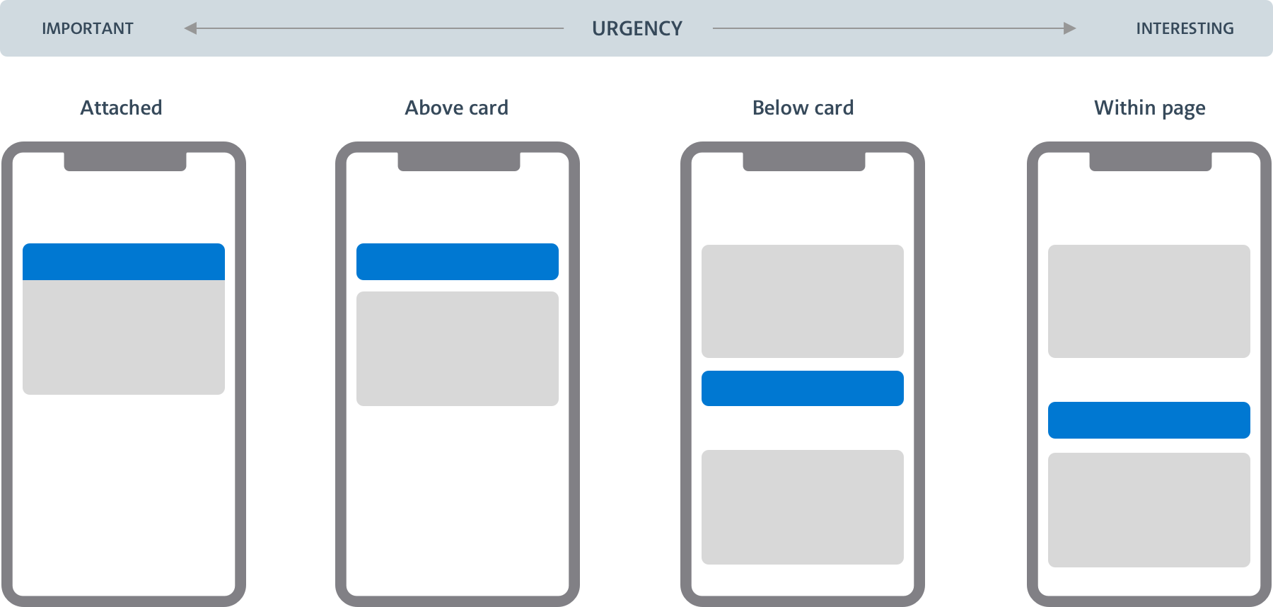
Placement
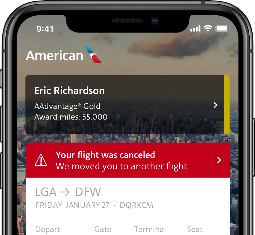
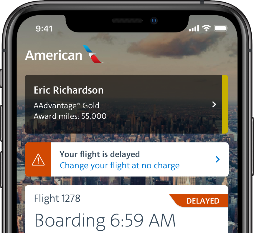
Callouts’ placement directly suggest their level of importance. Use callouts in context and in proximity to the content it relates to. The goal is to create a visual hierarchy and relationship between the different elements on the screen.
Treatment
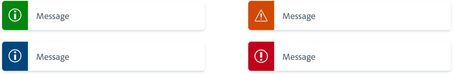
Colors and icons also help emphasize the purpose of callouts: green (success), blue (information), orange (warning) and red (error). Content should determine which callout variation to choose.
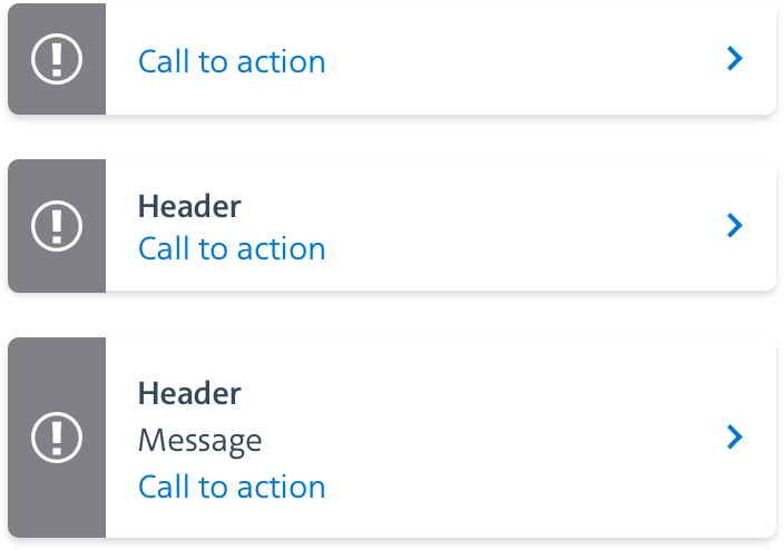
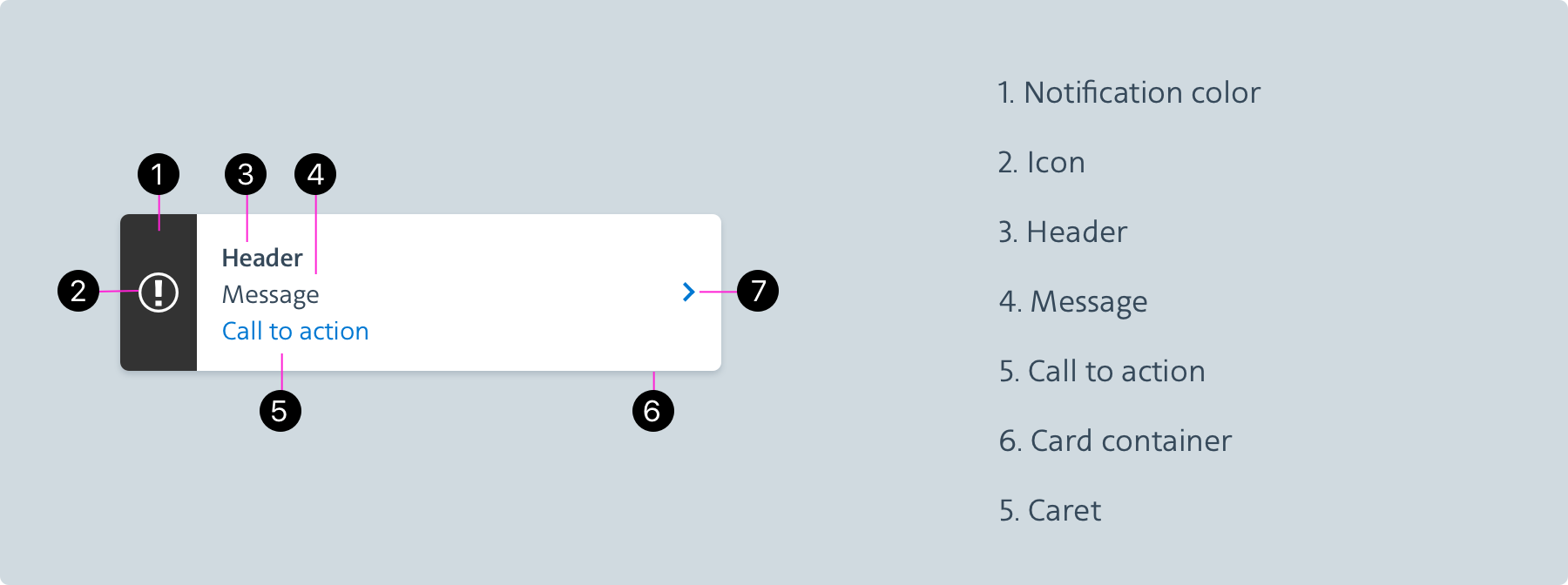
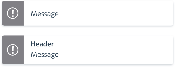
Design
The structure of a callout is determined by its content and intent. Some callouts are strictly informative while others require users to act upon them.
Behavior
Callouts are static or interactive. Interactive callouts have a call-to action and need to be actively acknowledged by users. They can direct users through a page flow or trigger a slider (information panel). Static callouts simply disappear when they’re no longer relevant.
Static
Interactive
Note: These images are from the iOS Callouts — Android does not have the chevron.