Teasers and sliders
Teasers and sliders
Notification drawers that slide up from the bottom of the screen
Examples
Usage
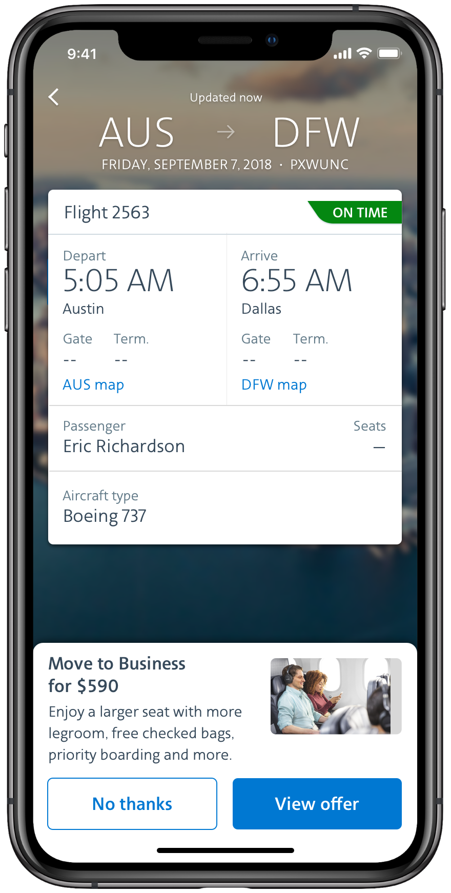
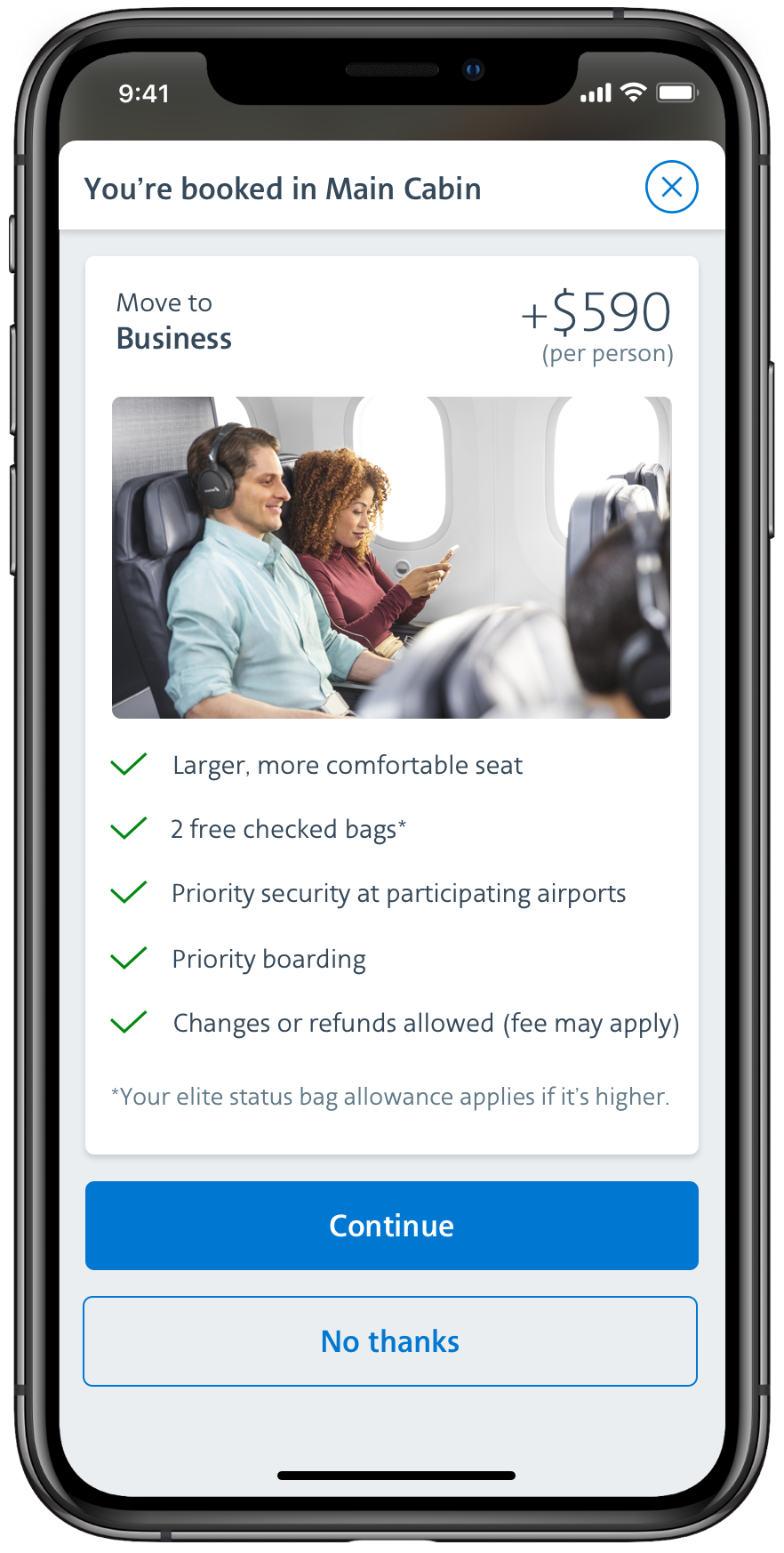
Teasers and sliders are contextual. They currently appear on the flightcard to provide users with information or offers related to their flight and membership status.
Design
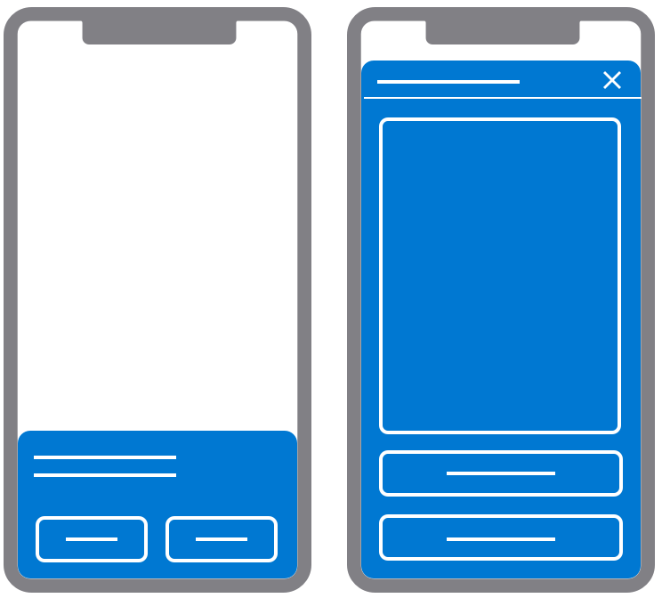
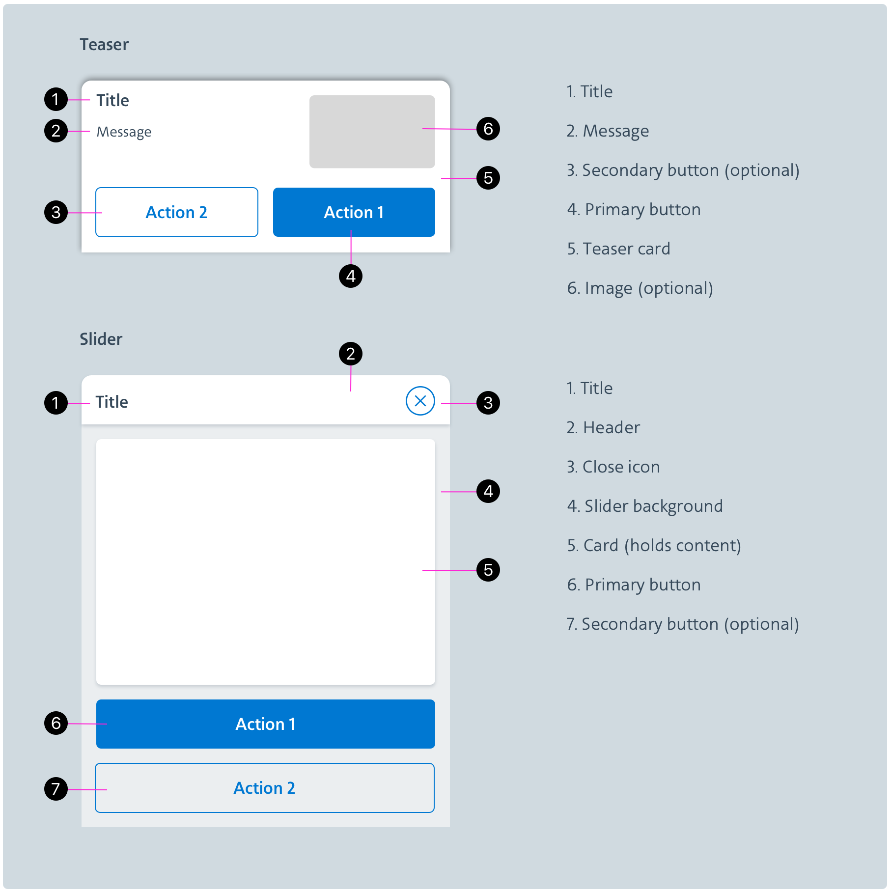
The size of a teaser is meant to be visible while keeping most of the page accessible. Its intent should be clear and concise and offer an option to opt in or out. A slider is the expanded form of a teaser or a standalone notification. It provides more content and invites users to engage in an activity.
Behavior
Notification drawers always slide up and over the page’s content from the bottom of the screen. Teasers are short and non-disruptive whereas sliders take over the page and force acknowledgment form users. Drawers’ content is meant to be easily understood, quickly adressed and simply dismissed.